UX & UI in Sports Betting – Is the Interface Holding Players Back?
TL;DR
UX UI in sports betting directly affects conversion, retention, and player behavior. Cluttered interfaces, slow performance, and poor mobile design lead to lost bets and early exits. Operators that focus on speed, clarity, and localized user experience create smoother journeys, increase engagement, and improve long-term player value.
Why is UX & UI important?
Imagine your player logs in right before a live match, prepared to place a bet. Instead of instantly placing a bet, they struggle and move slowly. Navigation is not intuitive, elements are hard to locate, and the flow breaks. By the time they figure it out, the moment has passed and the bet is not placed. Moments like this explain how players decide to stay on your site or disappear, and it all comes down to your UX, UI, and your interface.
What Really is UX and UI?
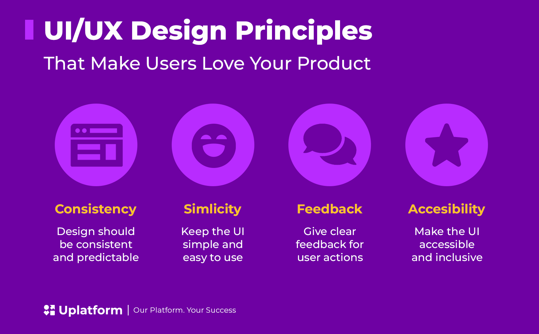
Lots of people talk about “UX” and “UI,” but for most, it is easy to gloss over what those terms actually mean and how much they shape the day-to-day side of their business. In simple terms, UX (user experience) is how easy and enjoyable your site feels to use, while UI (user interface) is how it looks and functions on screen.
The user interface (UI) covers everything you see and touch, from buttons to colors, symbols, and menus. The user experience (UX) is what you feel every time you try to use those things. The interface is the bridge between wanting something and actually getting it. When these parts work together, your betting site feels polished and easy to navigate.

Think of it like checking into a good hotel. The lobby (UI) welcomes you, the staff and layout (UX) keep it friendly, and the doors and hallways (interface) help you get to your room. If any step annoys you, whether it is confusing sign ups, slow service, or a room you can not find, it messes up the whole stay. Betting should be just as easy.
Where Players Get Stuck
Before a player ever places a bet, they face their first real test of your UX: the registration form. And it is where many operators quietly lose the players they worked hard to attract.
Overly long forms, unclear error messages, and no sense of progress are the most common culprits. Ask for too much upfront and players feel interrogated rather than welcomed. A phone number field with no format guidance, a password rule revealed only after submission, or a five-step form with no progress indicator — each of these sends the same message: this is going to be complicated.
The fix is not radical. It starts with asking only for what is essential at sign-up and leaving the rest for later. Real-time field validation that explains errors as they happen, rather than after the fact, removes the guesswork entirely. Social login options, via Google or Facebook, reduce the perceived effort even further, letting players get started in seconds.
As Dina, Head of B2B Projects at Uplatform, puts it:
“Onboarding effectiveness always lies at the intersection of content and interface. Ensure consistency across all devices and make every action as seamless as possible.”
A visual progress bar across multi-step flows keeps players motivated rather than anxious about how many screens remain. And showing value early — a welcome bonus, a highlighted feature, a piece of social proof — reminds the player why they signed up in the first place.
At Uplatform, registration flows are built and tested with real users, not assumptions. We track where drop-offs happen, identify the exact field or step causing hesitation, and refine until the path from visitor to active player is as short and friction-free as possible.
Other biggest turn-offs for players are cluttered designs and slow response times. It is hard to get excited about a wager when you are fighting through too many screens or the site freezes mid-bet. You tap “Place Bet,” and instead of instant confirmation, the website keeps on loading indefinitely. That tiny delay is all it takes for excitement to turn into doubt.
According to industry insights from PayNearMe, over half of online gaming players admit to abandoning a bet due to these headaches. That’s a lot of missed action, but it also shows how much better things can get when the friction is gone.
What Players Really Want
Ask players what matters most, and you will hear the same things:
- Clean design and fewer clicks.
- Speed that keeps up with their instincts.
- Personal touches like remembering favorites or suggesting timely bets.
- Localization – language, odds format, and sports that feel familiar.
Players do not see these as nice-to-haves anymore; they expect them by default. The easier and more intuitive a betting site feels, the longer players stay. For more on key sportsbook features and regional customization, check out Uplatform’s insights on must-have features for a successful betting experience.
Fixing the Friction
Here is the secret! Make everything feel easy. When logins are smooth, menus are simple, bet slips are clear, and results update instantly, betting stops feeling like a task and starts to feel natural.
That kind of experience does not happen by guessing. The best iGaming providers test, tweak, and test again. They use real users to try out every new feature, and quick prototypes help catch what feels off before launch.
That is exactly how we work at Uplatform. We watch how your players move through your site, where they pause, and how they react. Fresh feedback shows us what to fix and what to keep. And even after launch, we stay close, making sure your site keeps getting better with every update.
The result is an interface built around speed, clarity, and local fit. Every detail, from mobile menus to language options and payment methods, is refined to meet your players’ needs.
Designing for Modern Bettors
Modern bettors expect more because they get more from everything else they use online. They want mobile betting UX that fits any screen, bigger buttons, instant support, and features that feel personal, not generic. You can learn more about how to meet these needs in Uplatform’s article on mobile-first design.
Details like bright or dark mode, adjustable text, and responsive design show players that you’re thinking about their comfort.
And it’s not just about players. You also have to juggle local rules, age checks, privacy laws, and strict ad regulations. To strike a balance, operators must aim for peak player satisfaction while meeting their region’s iGaming regulations, such as those set by the Malta Gaming Authority and the UK Gambling Commission.
Where to Start
If you’re wondering how to begin, keep it simple:
- Run strict usability tests with real users, not just your tech team.
- Strip down menus to what’s essential.
- Build with mobile betting UX in mind.
- Use analytics to spot where players drop off or hesitate.
Each step you simplify brings players one thought closer to “done.”
The Real Edge
At the end of the day, nobody complains when placing a bet feels too simple. Stress-free experiences keep players coming back, replaying the fun, and telling friends about it.
Sometimes the edge isn’t in better odds. It’s in having a button that just works and makes everything easier.